UX/UI Design
UX/UI Design


So, what exactly is UX/UI Design?
UX/UI Design is the process of creating the user experience and user interface. Or, in other words, creating your user's journey across their whole experience with your app or website.
The navigation, information architecture, workflow, and heuristics of your product are all common parts of UX/UI design. This should all be done while ensuring that all of these pieces adhere to consistent and relatable branding that includes a look and feel targeted to your users.

UX Design vs UI Design
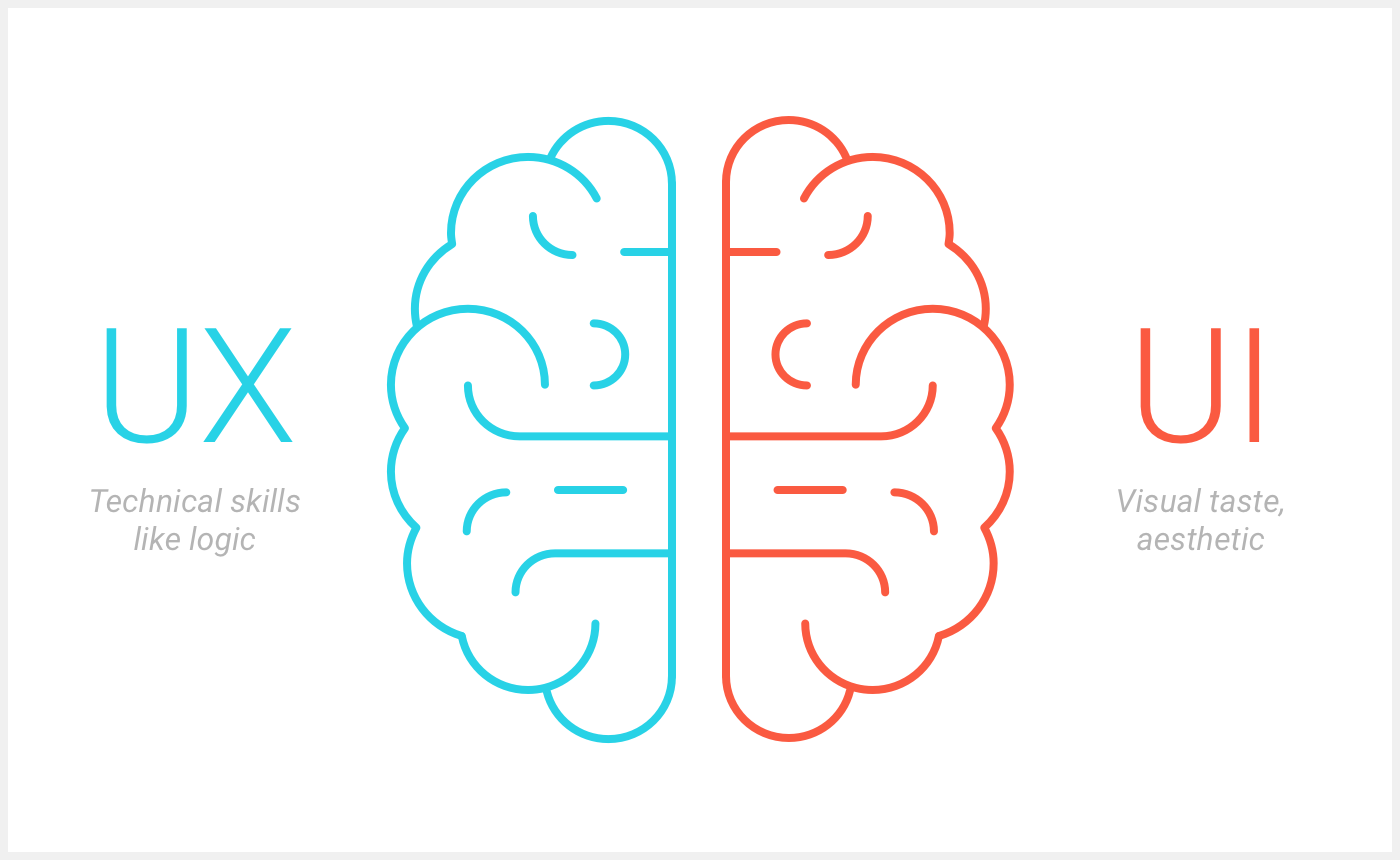
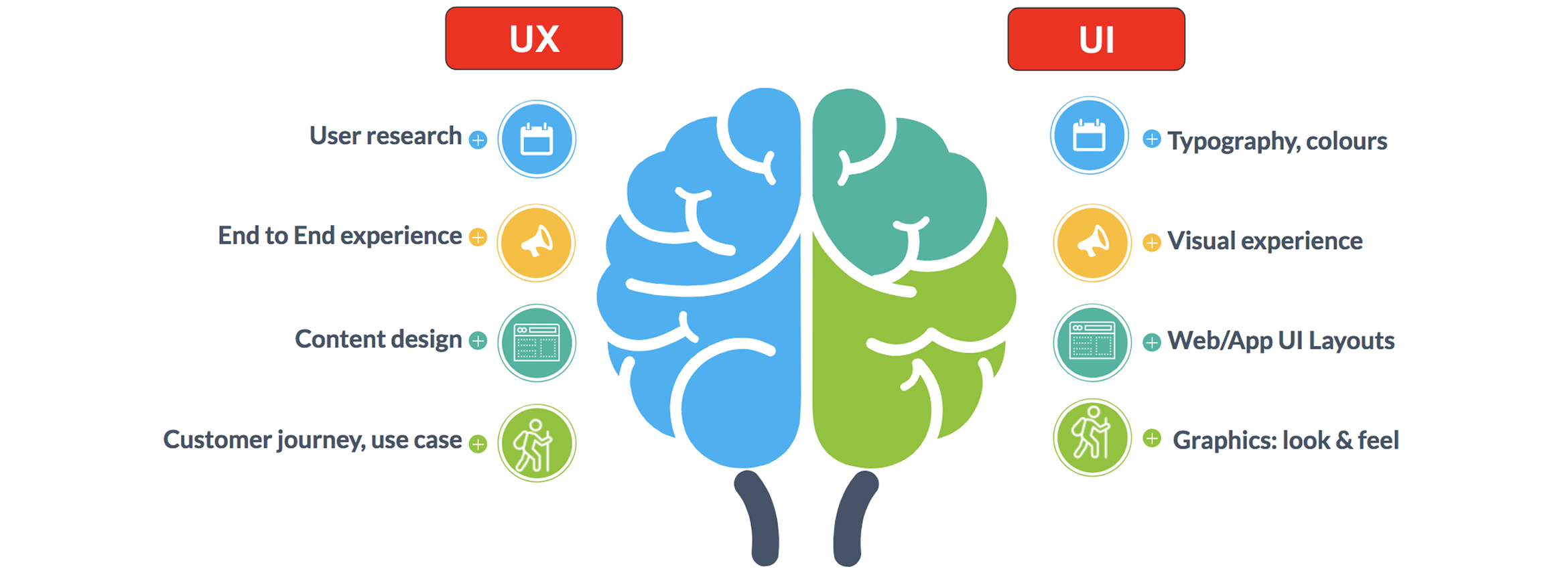
UX Design includes everything from usability, navigation, and workflow to aesthetics and even customer service. Your objective is to make your app as simple and effortless to use as possible, delivering your solution in the most personalized and effective way possible.
Because UI Design is a component of UX, the two are sometimes confused. However, UI is a vital, stand-alone component of your program. Color schemes and typography influence usability; branding and aesthetics entice users; and buttons, photos, text entry fields, and animations improve the user experience and conversion.
Deliverables
Information Architecture
Flow Maps
Design System
Low-Fidelity & High-Fidelity Wireframes
What is the process of UX/UI Design?
- Define the issue: Before we can begin designing, we must first understand why we are doing so. This can only be accomplished by thoroughly comprehending the issue at hand.
- Define our users clearly: We need to identify who we are fixing the problem for. The contextual issues customers may experience in their daily lives might assist us understand how to make our product perform best for them. And, while we uncover these things via study, we must precisely describe them before we begin developing.
- Ideate: As the lowest quality versions of the product we're constructing, we use design methods like narrative mapping and sitemaps. Before we get into things like page layout and UI, these assist us comprehend the product's complexity and hash out crucial problems.
- Define the main feature set that will best solve the current problem: We utilize user stories to narrow in on what important and eliminate the fluff that distracts from the core experience after we understand the essential functionality.
- Low-fidelity wire-frames: Once we grasp the product's direction and overall structure, we begin to imagine how these real pages would appear. At this point, we're both attempting to figure out things like layout and content placement. However, this level also serves as the next complexity filter. Here, we can begin to have a clearer sense of all of the material and sub-pages that will be required.
- Wireframes/design system with high fidelity: At this point, we've assembled all of the components in all of their fidelity and intricacy. We create technologies that make modifications and then hand them off to developers who can create pages that can be used in usability assessments.

Best UX/UI Practices
We adhere to the following UX/UI best practices:
- Developing user stories early on.
- Before diving into a project, map out its complexity.
- Constantly focused on the product goals as well as the design.
- Recognizing that design is only one step of development and that we are not separate from our development team.
- Limiting our focus and making what we focus on matter.